What Is A Mobile Website?
Summarize or Share at:
The meaning of mobile websites in one of the most straightforward terms will be those websites that are mobile-friendly. These sites get developed with responsive design, thus offering seamless browsing experience to mobile users.
So, why was it essential to turn the website to a mobile site?
The simple reason is that the number of people who use mobile to visit any website and stroll around a little on the sites is increasing day by day. It is nothing new that soon, mobile phones are going to replaces desktops and computers. That’s the reason why most website owners are trying to turn websites to mobile sites so that they can reach a high number of mobile users.
Why is turning the website into a Mobile Site profitable?
So, why are the website owners trying to invest more into their websites and trying to turn their websites into mobile sites?
The reason is SEO rankings or SERPs. As mentioned in the previous section, the number of mobile users increasing every day, and the amount of traffic generated by them is growing significantly. Moreover, mobile phones are becoming so technologically advanced every day, that things that were not possible without using a computer, can be done with the use of a mobile phone. It has become convenient as well. Thus, a large number of people tend to use mobile phones to get into websites and look for information and provide information.
Website owners are trying to take advantage of this situation by trying to make their websites mobile-friendly. Because when a site becomes mobile-friendly, the owner gets the opportunity to get more traffic, which leads to more conversions and profits for the website owner.
What are the Advantages of Mobile Websites?
Now there are multiple advantages of having a mobile website. You need to understand why you should go ahead and make your website more mobile-friendly.
1. User-Friendly

The mobile-friendly sites are undoubtedly more user-friendly, as users can visit sites from quite a few devices. The people who get into your website through a computer will have a different experience than the visitors who come to your website through mobile phones. If you go to customer research and web analytics, you will understand that the visitors from mobile-friendly sites can easily access some information that visitors from computers cannot.
For example, your phone number or your residential address could frequently be located by the visitor. It means that if the visitor is interested in what product or service you are selling, then the visitor has the potentiality to become your customer or client. Many a time, the mobile site may also prompt the mobile user to contact your number or provide the visitor with a GPS map. Mobile visitors, however, do not read the website’s press release or blogs, and that can be one of the disadvantages of mobile sites.
2. Easier implementation Process

If you have a website, there is no issue if you try to make a separate mobile website with the same domain and ownership. It is a relatively more natural process because mobile sites can get developed quickly based on the original website. Another advantage is that the mobile website runs independently from your mobile website. So, if you want a mobile site for your business, that won’t be much of an issue for developers.
3. Improved Performance

It is very irritating for your visitors if your website takes more than a few seconds to load. The main reason why few sites take a long time to load is that the website has a massive amount of data and processing that much data takes time. That is not the case with mobile sites. The reason is that mobile sites are technically a smaller version of the original site.
Thus, they have lesser data to process for loading, and the process is smooth and comparatively faster than the desktop version. Since there is less data, it is also beneficial for mobile users who are very conscious of the amount of data that they consume every day. The visitors will not need to bother about how much data your website will be consuming; thus, there will be an inevitable hike in the traffic that website acquires once you turn website to mobile site.
What are the Disadvantages of a Mobile Website?
There are several disadvantages to owning a mobile website as well. If you are trying to invest in owning a mobile website along with your original website or want to turn the website to a mobile site, then you should also know about the backdrops of a mobile website.
1. Lacking Proper Information
The lite version of any website is quite accessible, but everyone does not favor it yet. Most sensitive sites with personal information are mostly availed through computers and not through smartphones or iPads. You need to have a website that will be favored by target audiences.
It is evident that the mobile sites, being a lighter version of the original website, will help the visitors avail all the information that one would get from the desktop version of the site. However, shortly, with technological advancements, mobile websites will become more accessible with proper details regardless of the device being used for visiting a website.
2. Troublesome Website Addresses
Mobile Websites are sometimes risky in the sense that the visitor may get directed towards a different website. Many mobile sites fail to solve the issue of redirecting the visitor to the correct website address. However, this issue is resolved when the same visitor visits the website through a computer. Many in-built features do not find space in the lighter version of the website. These in-built features help in redirecting the visitor to the correct site; thus, the visitor gets lost in irrelevant or suspicious websites. Other links on your page can also create the same problem and misdirect the visitor.
3. Excessive Updates
When you have more than one site, you will need to keep in mind that there will be double the amount of updates pending. You will always need to keep updating all the things that you posted or added to your original website. But there are ways you can get rid of this additional headache. Many mobile sites can automatically update whenever new data or information has been posted on the parent website.
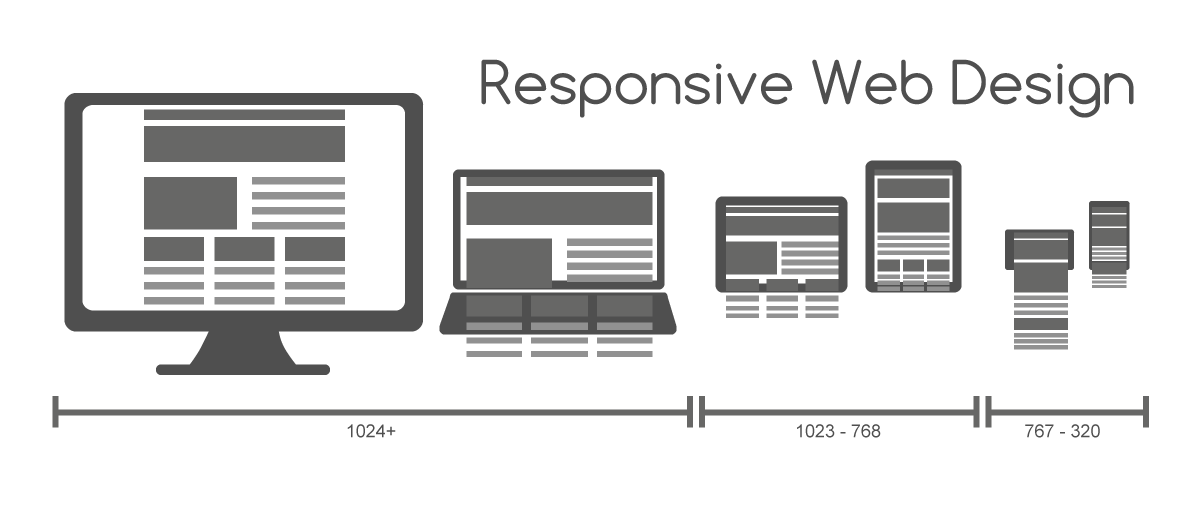
What are the types of Websites?
There two types of Websites technically. One is the Responsive Website, and one is the Normal Website. But there are a few differences between a responsive website and a normal website. So, let’s get to know more about the difference between these two types of sites.
1. Responsive Website:

At a glance, the Responsive Website has only one website address along with it. It has the same amount of content as the computer website. The visitors can easily access all information, and they will not need to rely on the computer to get the full report. Regarding the update stress, with Responsive Websites, you do not need to keep worrying about updating on both the websites. Updates are mostly automatically done.
Responsive Websites are not much research-based, and the website owner does not need to keep researching new technologies. The time can be donated to other sectors instead. They are generally fast but sometimes they fall behind mobile webpages. This can be accounted as one of the disadvantages of Responsive Websites.
The implementation process is comparatively easy. An original website can be made into a responsive website within a few hours with a small amount of codes. However, the visitor might feel confused with the “view full site” option, but this is a great way to show excess information.
2. Normal Website

On the overview, standard websites are mostly the real website and then its lighter version. Simultaneously, there are two website addresses as well. The visitors might get disappointed with the lack of information. Some essential features are also missing on regular websites. Above that, the headache of the updates remains intact. You will need to keep track of your updates and update regularly on different platforms.
Whenever there is a new device, the codes need to be input immediately so that the visitors do not get misdirected towards other links or suspicious sites. The website owner will need to continually keep researching on the new technologies that are available so that the regular website’s experience can be improved.
However, one plus point is that regular sites are much faster when compared to Responsive Websites. The implementation procedure is not that complicated. The process is easy and better for new sites.
This is a fundamental difference between a responsive website and a normal website.
How to get a Mobile Website?
If you are struggling with the idea of how to get a mobile website or how to get a mobile version of the website, then you are in the right place. I will give you a small brief, which will help you in understanding how to go about the process. These are a few steps you can follow:
1. Get a Responsive Website
There are various tools available in the market, which can help you make your existing website a responsive website. This will be beneficial for you in many ways, like the display of the webpage improves, and it gives the same feel as the desktop view would.
2. Navigate your Information Properly
Since Mobiles Phones are available at the tip of the hand, the information should be available at an instance. You need to find ways to improve your navigation quality and help your visitors find the correct website.
3. Avoid Using Flash
Flash has become extremely unpopular since it has been declared as a risk for SEO. The main reason is that it slows down the loading of the website, and it makes the visitors opt for other websites which would load at an instance in the absence of Flash.
4. Use Viewport Meta Tag
If you enable the Viewport Meta Tag, it will help the visitors in adjusting the website and aligning it with their phone’s width. It is a simple HTML code:
<meta name=”viewport” content=”width=device-width, initial-scale=1″>
5. Turn on Autocorrects
If your website is on that involves frequent filling up of forms and documents, you must include the AutoCorrect format. It will also be beneficial if you allow calendars for filling in birth dates.
6. Enlarge your Button Sizes
Your website’s click buttons need to be enlarged because the fingers might not reach small buttons. Touch-sensitive mobile phones might react differently than mouse sensitive clicks.
7. Enlarge your Font Size
You also need to enlarge the font size to allow the visitor to see and read the information without trying to magnify any given information.
8. Compress CSS and Images
If you want to save data and improve the speed of your website loading, then you need to compress the CSS and high-resolution images.
9. Switch to Desktop View
Just to give a better visitor experience, make sure you include Switch to Desktop View option. The process will help the screen adapt to the phone and still give a desktop view.
10. Evaluating Mobile Testing
You should keep evaluating how fast your website is loading on the phone with how much relevant information. Taking this step will help you largely in gaining better SERP rankings.
These are the ways how to get a mobile website or how to get a mobile version of the website.
Parting thoughts
Mobile Website is a next-generation invention where computers will be taken over by mobile phones. But still, there is a long way to go because statistics say that 87% of small business yet have not made their website mobile-friendly. Thus, to stay in the competition, one needs to follow the trend and make their sites more mobile-friendly. If you own a business venture and wish to reach out to numerous prospects, developing a mobile-friendly website will be the first thing to do. After reading this guide, the process will undoubtedly be smooth for you.