8 Tips and Secrets to Enhance Your Web Design and User Experience
With the internet taking over the world by storm, there are roughly 5.2 billion internet users. This figure is steadily rising day by day. The main reason being businesses are now focusing on web design, and they are generating a lot of leads from the internet.
A user will decide how useful your website will be to them within the first five seconds after landing on your website. They will determine what your company does within those five seconds and judge how easy it is to navigate your website.
If the website has quality content, an attractive layout, the color palette is used correctly, and is easy to navigate; they will spend more time on the website and learn more about your service. Around 88% of customers expect businesses to better their digital initiatives.
If the website does not meet certain standards, it will reflect on your statistics, as you will have a low bounce rate, and the number of visitors will also reduce day by day.
Therefore, it becomes essential that you update your website regularly, adhering to the new regulations and algorithms set by the search engine.
If you neglect these aspects, then your website will be in trouble, and you will pay the price as the number of visitors will reduce over time.
Hence, to help you ensure your website stays relevant and gets a higher ranking on the search engine, today, we will discuss a few tips and secrets that will enhance your website. We have jotted down these tips from our years of experience.
These secrets will also improve navigation issues, confusing layouts, design flaws, etc. So, without any further delay, let’s begin.
1- Remove unnecessary distractions from the web pages
Certain aspects of your webpage will distract the audience and will never properly convey the message you’re trying to convey. Usually, the audience will have an attention span of eight seconds if they are interested in your blog. So, try to keep it to a bare minimum.
Hence clearly mention what the user wants to focus on the website and ensure they are not distracted by ads or unnecessary videos or audio disturbances.
For example, do not use complicated animations or length content to explain a simple point and stock images. Use images that will be easy on the eyes, and the font styles should be readable.
You must figure out where the user’s attention should go the moment, they enter your website. The main role in gaining attention is played by the color combination and how to arrange the items.
2- Always add a call to action
Once the potential clients have visited your website, it is time to guide them through the place and let them explore your services. Once they start exploring the services, it is crucial that you provide some call to action that will help them contact you at the end.

If the call to action is not placed at the end, the users will be confused about what they should do next? But if you add the call to action, it will give them something to do after going through your home page or service page.
For example, if a visitor is currently viewing a website that explains everything, they need to know about SEO services, there are chances they are still learning about SEO services. Hence, instead of adding a contact us button at the end, take them to another age of yours where you have explained in detail about SEO services.
This will more likely convert the visitor, and they will be interested in learning from you and, in the end, will contact you for your services.
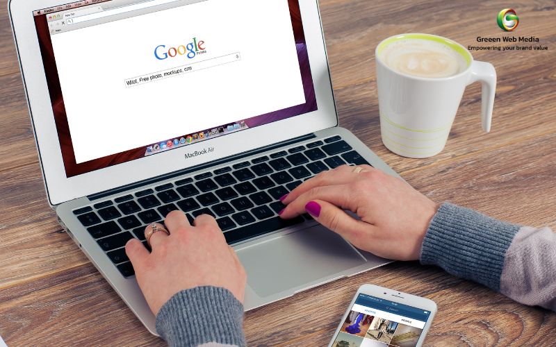
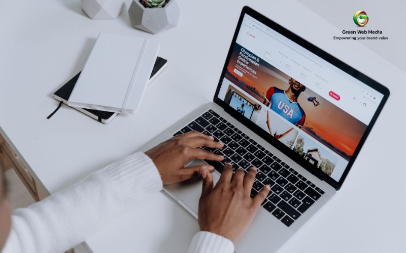
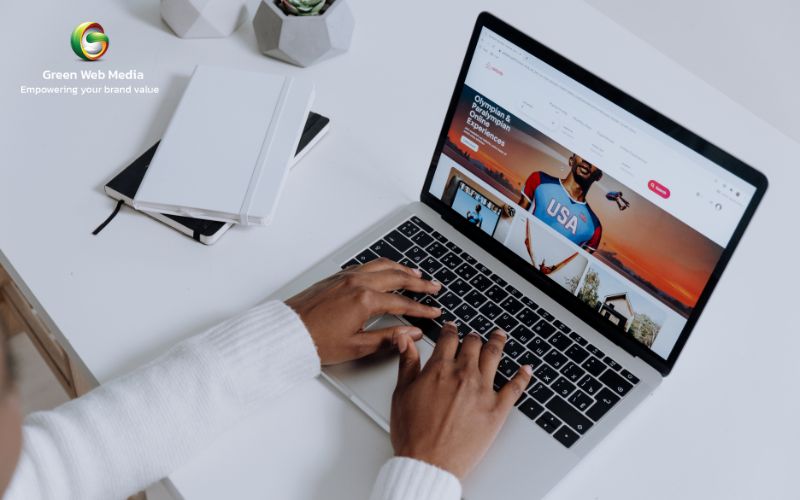
3- Try using your original photos
Professionals always recommend clicking original photos for their website. However, if that is not an option, several techniques can help you choose the right type of stock photo.

Although if you’re using stock photos, do not use cheesy images. These include people in a group smiling at each other, people high-fiving each other with bright smiles, or children and families looking at the camera, people jumping in the air, or people giving thumbs-up in professional attire.
These images subconsciously project negative illustrations, and the clients think the website has nothing original to offer them.
Instead, use images that are very realistic and images that are taken in a well-lit environment. Always use images that one can see in their everyday life. These include hands over a laptop, people shaking hands, or some keywords displayed on a laptop, etc.
Using original photos will ensure the visitor that the brand can be trusted and they will provide them with genuine services.
4- The website should be easy to navigate
The most crucial thing to consider while designing your website is to ensure the website is easy to navigate. If your website is easier to navigate, visitors will be interested in your services and will spend more time on your website.

When advertising your business online is concerned, nothing is worse than having to browse through a difficult-to-navigate website. Using poor designing habits like overstuffing the navigation by confusing hypertext and lack of organization makes it very difficult for visitors to know where they should go.
If the users can’t find something of value on your website, it makes no sense to stay on the website for longer. One key aspect to add is to give a one-liner about the page you’re displaying. This will let them know what they can expect from the web page.
5- Use white space to the fullest
White space is something that is added to the website to increase the readability and ensure the webpage is easier on the eyes. The white spaces are also known as negative space, and it is a space that lacks content or visual items.
The whiter space you use in your design, the easier it will be for the user to navigate through the webpage. Although using too much whitespace also means you have no content, it also creates a worst impression than jam-packing the content in a single page.
Add the content in the middle of the screen, so this way the user’s attention is not diverted by focusing on several aspects in a webpage. Using whitespace will also give them an idea of where the content started, the subheadings, and where it will end. Correctly using the whitespace will bring you wonders in terms of monthly visitors.
6- Your website should be compatible with several devices
Nowadays, optimizing your website for computer use is not enough. It would be best if you optimized for mobile devices as well. Around 80% of users browsing the internet have smartphones. The statistic alone is nothing to help you understand the importance of making it compatible on several devices.

If you haven’t made your website compatible with smartphones, it is high time you do this now. It isn’t just something that you must do since everyone is doing it. It is a step that you must take as a business owner.
There won’t be bigger changes when you make the device compatible with several devices. But it would change the overall layout, and hence you must get it done for the best results.
7- Test and make some changes
Designing the website is always like a trial-and-error method, and there is always a chance and room for improvement. Improving these aspects will aid in improving the conversions, time visitors spend on your website, and you will also know the best solution required for your website.

The best way to see the result is by comparing two references for your website. Consider two aspects, for instance, A and B, and then test them against each other. Testing them will help you know which areas need work and which areas are working fine the way they are.
You can also design some updates, compare them with previous versions, and know whether or not the updates have improved the page’s performance. Small updates such as button changing the font size or simply adding or removing a couple of animations can also drastically change the website.
8- The prices should be right at the center of the screen
The user should never feel like you’re hiding the prices. This would subconsciously give them an idea that you are hiding something and that your services are shady and unreliable. Therefore, always display your prices for the services right where they will be easy to find.
Do not add variations like basic plans, standard plans, and premium plans. This leaves a negative impact on some viewers, and they might not be interested in buying your services. Therefore, please do not follow the same routines that some of your competitors follow, instead develop something unique and see how it works.
Final thoughts
These were a couple of secrets that we are sure will help you design the best website for easy navigation and usability.